


|
|
This chapter presents a simple tutorial that walks you through the procedures for creating a device property file. You will learn how to use the new device property files to enable the J2ME Wireless Toolkit to emulate applications for the device. See Chapter 3, "Examining Device Property Files” for a detailed reference on device properties, the custom-tailoring options available, and how to use them.
In the following step-by-step tutorial, you will create a device definition for a device called NewPhone. Because of the similarity of NewPhone to the DefaultColorPhone device included with the J2ME Wireless Toolkit, the tutorial adapts the existing property file for DefaultColorPhone.
The steps of the tutorial are:
You will create a device property file for a new emulated device called NewPhone.
The first step in creating a property file for NewPhone is to copy the directory associated with the existing device, DefaultColorPhone, to the new directory NewPhone and to rename the main property file.
C:\WTK21.)
You need to provide image files for the new device. These image files should differ only in their representation of the active buttons. (Active buttons are those buttons used in the emulation of the device in the J2ME Wireless Toolkit.)
The image files are:
These images are used by the Emulator to show visual effects when the user moves the pointer over, or clicks on, a device button. The device backlight is turned when a MIDP API is being called or when communication over the network is taking place. An image file can be in JPEG, GIF, or PNG format.
For example, if the device has a screen of 96 pixels horizontally by 128 vertically, your images should have the same size as the screen.
NewPhone directory in place of the following files, respectively:wtklib\devices\NewPhone\ph1_neut.png wtklib\devices\NewPhone\ph1_press.png wtklib\devices\NewPhone\ph1_highlight.png wtklib\devices\NewPhone\indicator.png
NewPhone.properties, if they are different from the names already present.default_image = ph1_neut.png pressed_buttons_image = ph1_press.png highlighted_image = ph1_highlight.png
NewPhone.properties, if they are different from the existing locations. The network indicator location property has the following format:Where x is a horizontal distance in pixels to the network’s indicator left top corner, y is a vertical distance to the network’s indicator left top corner, width is and indicator’s image width and height is an indicator image’s height. For example:
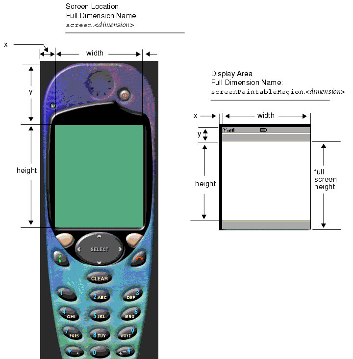
Referring to the left image in FIGURE 1, you specify the location of the top left corner of the screen relative to the top left corner of the device image by two lines of the form:
Referring to the left image in FIGURE 1, you specify the total screen size by two lines of the form:
Referring to the right image in FIGURE 1, the display area (or paintable region) is that part of the screen that is available to applications. The remainder of the screen is for icons and soft button labels.
The coordinates of the display area are relative to the screen location.
You can specify the display area used by the application to be a subregion of the screen by four lines of the form:
screenPaintableRegion.x = <horizontal distance to display area>

screenPaintableRegion.y = <vertical distance to display area>

screenPaintableRegion.width = <width of display area>

screenPaintableRegion.height = <height of display area>
The MIDP 2.0 specification allows applications to use the full screen area. The Default Emulator defines the coordinates for a full screen as follows:
screenPaintableRegion.x, screenPaintableRegion.y). screen.x+screen.width, screen.y+screen.height). Customization of the display area will be available in future versions of the Wireless Toolkit.
A button on the emulated device is defined in the main device property file by name and screen location in the following form:
where the parameters are as follows:
DefaultColorPhone: 0, 1, 2, 3, 4, 5, 6, 7, 8,9, POUND, ASTERISK, SEND, END, LEFT, RIGHT, UP, DOWN, SELECT, SOFT1, SOFT2 and POWER. For information about how to use additional button names, see "Device Buttons" .” The button location and dimensions are used for two purposes:
The region for each button should be defined to be large enough to cover the button's area on all three device images. However, be careful not to allow the buttons' regions to overlap each other.
The button coordinates are shown in FIGURE 2.
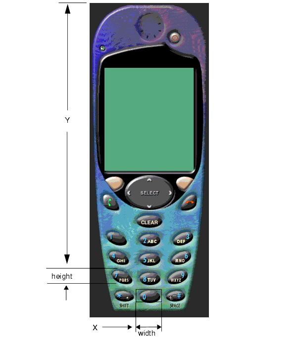
NewPhone.properties:button.0 = 66, 417, 41, 22 button.1 = 21, 319, 41, 22 button.2 = 66, 320, 41, 22 button.3 = 110, 320, 41, 22 button.4 = 20, 352, 41, 22 button.5 = 65, 352, 41, 22 button.6 = 112, 352, 41, 22 button.7 = 21, 384, 41, 22 button.8 = 65, 384, 41, 22 button.9 = 111, 384, 41, 22 button.POUND = 110, 417, 41, 22 button.ASTERISK = 21, 417, 41, 22 button.SEND = 25, 295, 32, 17 button.END = 114, 295, 32, 17 button.LEFT = 37, 254, 26, 26 button.RIGHT = 114, 253, 23, 27 button.UP = 69, 232, 35, 22 button.SELECT = 65, 257, 43, 23 button.DOWN = 70, 284, 34, 21 button.UP.1 = 4, 87, 10, 18 button.DOWN.1 = 4, 189, 10, 20 button.SOFT1 = 29, 228, 33, 20 button.SOFT2 = 112, 227, 32, 20 button.POWER = 33, 52, 18, 10
NewPhone has two soft buttons—similar to the DefaultColorPhone. Their label areas are displayed in the area of the screen that is available to icons. This area is not directly accessible to the application. FIGURE 3 shows the soft button labels Undo and Menu on the lower part of the device screen.
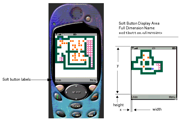
A soft button label display is defined by a line of the form:
where the parameters are defined as follows:
NewPhone.properties:
An icon in the context of the Emulator is any graphic, constant or variable, that is displayed on the device screen global region (the region that is outside of the drawable area). This includes scrolling indicators, the battery level indicator and any other images of a similar type. See Appendix A, "Default Emulator Device Property Files” for a list of the icons provided with the J2ME Wireless Toolkit.
Icons are used by the J2ME Wireless Toolkit emulator to indicate the status of several operations to the user:
left, right, up and down icons indicate the possible scrolling operations.inmode icon indicates the current text input mode (Capital letters, small letters or numbers).domain icon indicates whether the current MIDlet suite is assigned a trusted domain.An icon is defined by:
DefaultColorPhone defines the following set of icon names: left, right, up, down, inmode, internet, reception, and battery.The screen location and initial state of the icon is defined by a line of the form:
The icon states are defined by lines of the form:
icon.<name>.<state #1> = <state #1 image_filename>

..

icon.<name>.<state #n> = <state #n image_filename>
If an icon does not have an image for a particular state, only the name of the icon need be given, and the image field can be left blank.
Image files can be in GIF, PNG, or JPEG format.
NewPhone.properties:icon.up: 44, 112, off icon.up.off: icon.up.on: up.gif icon.down: 44, 118, off icon.down.off: icon.down.on: down.gif icon.left: 36, 114, off icon.left.off: icon.left.on: left.gif icon.right: 52, 114, off icon.right.off: icon.right.on: right.gif icon.internet: 64, 1, off icon.internet.off: icon.internet.on: internet.gif icon.reception: 2, 1, on icon.reception.on: reception.gif icon.battery: 78, 2, on icon.battery.on: batt.gif icon.inmode: 28, 2, off
Two properties are provided to control the color in the Emulator:
isColor property determines whether the display is grayscale (false) or color (true).colorCount property controls the number of colors available (when isColor is true) or the number of shades of gray available (when isColor is false). For a device with a grayscale screen, the background color of the screen can be set. The color is defined as a hexadecimal integer according to the standard Java color map. That is, the integer has the form RRGGBB, where RR, GG and BB are the red, green and blue components of the color, respectively. For example, white would be 0xffffff and red would be 0xff0000.
The background color is defined with the property screenBGColor.
The new device, NewPhone, now appears in the list of available devices in KToolbar. If you are already running these tools, you must restart the application to see the updated list of devices.
|
|
Basic Customization Guide Java™ 2 Platform, Micro Edition, Wireless Toolkit, Version 2.1 |
Copyright © 2003 Sun Microsystems, Inc. All rights reserved.